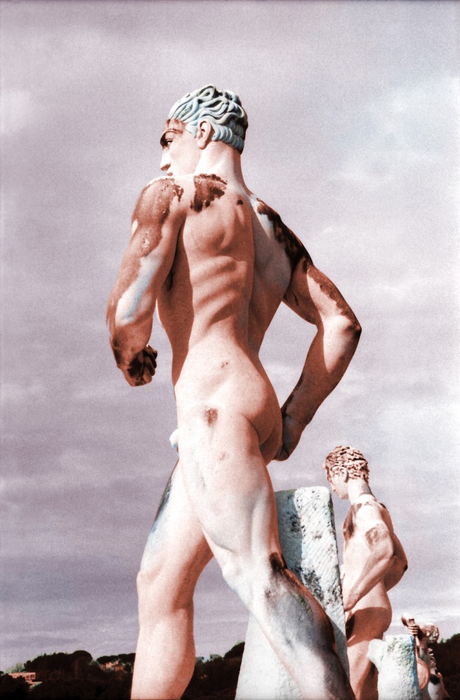
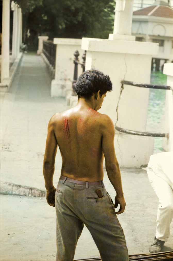
Who came first, Every Person or All the Buildings in New York?

Frankies@457CourtStreet

Firehouse in the Bronx

Can James Gulliver Hancock really do it, draw all the buildings in New York? Well, considering that his previous projects were All the Cars in L.A. and All the Rain in London, that stated goal may be a bit of hyperbole – after all he is not still stuck by the Freeway dodging drive by shootings or getting soaked miserably under an overpass at Waterloo Station, so I guess he eventually had to do like Nixon: declare victory and quietly accept the opposite. In any case, even failure at drawing all the buildings in New York is already looking like a great success.

Hancock, an Australian artist, says he began his project about four years ago. Apparently, he is working diligently at it in order to finish just in time to start all over again, several decades from now.

Self portrait?

I love the drawings, all of them: skylines, skyscrapers, collections of snowy cars or character studies. But I especially love what must be considered his forte: the  funky precariously assembled old New York buildings: tenements, row houses, factories, garages. Whereas other buildings may look a bit clumsy and self-conscious, these old veteran New York edifices always look  very comfortable lounging in his drawings, bulging at the seams or leaning dangerously amid the microscopic airborne ufos that surround them on the  paper as they do in real life. On a visit to his blog one can also shop for drawings, originals at art prices and giclee prints at more reasonable prices. It looks like he has found a way to make a living at his art – Way to go, James! His work is easy to find on the web and in the media, as this project really touches a soft spot in every New Yorker’s heart. Check him out at Brain Pickings and at decor8.

All three images from his blogspot, All the Buildings in New York.

As crazy as All the Buildings might sound, it is not the first such idea and won’t be the last. Jason Polan is doing Every Person in New York, and he has been doing them for several years. And he has got the blog to prove it. in fact, several blogs…. since he seems to be of a less linear minded bent than James, Jason is also drawing every position of his own hand! and if that weren’t ambidextrous enough, he seems to be the eminence gris behind the 53rd Street Biological Society, which is probably not located anywhere near 53rd Street and has as much or as little to do with biology as you or me. Of course, all of this is psychotically ambitious, so he has made certain accommodations for himself. If I am assuming correctly, he is waiting for Every Person in New York to eat at the Taco Bell on 14th Street. All three images from Every Person in New York Blogspot.

Check out his great drawings of Every Person in New York and those of all the other fabulous artists linked to on the Taco Bell and Biological websites!

German Expressionism: The Graphic Impulse and the MoMA Straggler

Otto Dix. The Sailor and the Girl, 1923

The Bridge (Die Brücke), the Blue Rider (Der Blaue Reiter), New Objectivity (Die Neue Sachlichkeit). These are all manifestations of German Expressionism from the early Twentieth Century. This is a movement in visual arts that gave voice to the anguish, disgust and flickering hopes of people in the German speaking world as they witnessed the disintegration and decay of society around them. It is this tragic context that gave them their inspiration and motivation to create truly exceptional work and it is the context which ultimately condemned them to obscurity.


For the past two months, the Museum of Modern Art in New York has had an exhibit of German Expressionist works on the sixth floor, nearly all of the works taken from the museum’s permanent collection. As the subtitle “The Graphic Impulse” implies, it consists mostly of printed work: lithographs, woodcuts, aquatints, illustrated books and pamphlets and posters with a few other works (paintings, sculpture, etc.) thrown in. It would be well worth the visit, except that, once again, I am seeing an exhibit on its last day and then writing about it, so forget it. However, since these works are in MoMA’s collection, it can be hoped that some of the work will be on display at any time.


The exhiibit begins with Die Brücke, a group of German artists who began working in the area of Dresden in the first years of the century, eventually moving to Berlin and losing themselves in the chaos of the First World War. The founding members of this group: Ernst Ludwig Kirchner, Karl Schmidt-Rottluff, Erich Heckel and Fritz Bleyl were not trained as painters but rather as architects, and their approach to visual art was free of historical constraints and conventions. They took their inspiration from their immediate

Max Pechstein. Fischerboot. 1913. At Brücke Museum, Berlin

surroundings, both in the press of humanity around them and in the latest trends of the art world: Fauvism in France for its colors and the work of Edvard Munch in Norway for its expressionist angst. But apart from the angst, in those days there was still a sense of optimism about the future, and some peaceful and forward looking themes can be discerned in the jarring colors, jagged lines and sexually provocative works here. The group is filled out with later members Emil Nolde, Max Pechstein and Otto Mueller.


I know these artists from the wonderful museum in Berlin dedicated to them, called Die Brücke Museum. There one can see many oil paintings which, according to my guide at MoMA, were done by these artists almost as an afterthought, as show pieces for exhibitions and for the prestige and recognition that such works could provide the artists. The MoMA collection emphasizes the smaller but powerful printed works: lithographs and other prints which were the media that lent themselves to experimentation and freer forms of expression than oil on canvas. However, if you are a fairly simple minded art consumer like me, you may prefer the aesthetics of the paintings, like those in Berlin and the few that were here on display in New York for their aesthetic achievement.


Next, after this introductory section, the New York exhibit moves to Munich and the Blaue Reiter group. That group is represented here by Wassily Kandinsky and Franz Marc with a couple of interested illustrated books and several paintings and prints. There is a spiritual feel to these works, especially the imagery of the horseman in Kandinsky’s painting and the naturalistic animism of Marc’s wildlife. Then on to Vienna, where Oskar Kokoschka and Egon Schiele were working. Here the colors are often less vibrant and the subject matter darker as well. These artists did not work as a collective or ideologically unified group, but rather as rivals, and that antagonism seems to have infected the works in a creative way. The exhibit curators deftly juxtaposed works by the two artists in which they seem to present alternative forms of the same vision. The drawings and lithographs of these two artists are wonderful, and are much deserving of wider renown. They are forceful and iconoclastic and quite beautiful in spite of their intensely critical view of society.


Otto Dix. Corpse in Barbed Wire. 1924

Then the exhibit opens up. The Great War has begun and it has swallowed up the energy of the society, as well as most of the artists. All hope for the future seems futile, and some of the artists, such as Franz Marc are quickly killed, others, like Max Beckmann suffer nervous breakdowns and life changing depression. The ones who survive are forever changed by the brutal experience and their expressionism takes on a grotesqueness and ferocity that is impossible to describe. The set of 50 prints by Otto Dix depicting the brutality of the trenches that he survived for 4 years are like a ground zero in the midst of this collection. They are displayed all together, a series of devastatingly forceful images of ripped up faces, decomposing corpses and horrifying nightmares. Käthe Kollwitz, the one woman in the show, is also well represented here, with some powerful woodcuts illustrating the sorrow and despair of the first postwar years. Her 1920 woodcut In Memoriam Karl Liebknecht is a beautiful work, showing the body of the murdered communist revolutionary laid out on a bier, with a group of mourners looking on. It is bold and modern and truly of the time, yet it reflects a tradition of hagiographic lamentation scenes that goes back at least to Medieval and Renaissance depictions of Jesus, such as Mantegna’s Dead Christ with the body oddly foreshortened on its bed,  and goes forward to the photographs of the dubious Che Guevara laid out on a wooden table in Bolivia. There are many lesser known artists here, interesting not only for their work but also for their often tragic biographies. The artist Wilhelm Lehmbruck is represented by some thin drypoint sketches and two massive sculptures of a delicately introspective man and woman, all produced in the few years before his suicide in 1919.

Käthe Kollwitz. In Memoriam Karl Liebknecht. 1920.


The final stylistic movement, Die Neue Sachlichkeit, or New Objectivity, is not only a new aesthetic style that attempts to bring the expressionist impulse to terms with the world around it, it is also a realization that the world of German culture had been mortally wounded by the constant upheaval and catastrophic political dynamics of the homeland.  A level of cynicism and despair pervades these works as they resign themselves to representing disgust and horror without offering any glimmer of hope. They chronicle the life of Germany throughout the 20s and into the rise of Nazism, so who can blame them for their unmitigated gloom? Die Neue Sachlichkeit leads inevitably to a dead end. The repressive political forces which had been a constant theme have gotten the upper hand and taken their revenge. The Nazis label these artists as degenerate and destroy as much of their work as they can get their hands on, banishing it from public view. The revulsion that other cultures feel toward Nazi German considering all the suffering and loss that Hitler’s actions cause has made the world turn its back on these artists, making them twice victims. And The rooms end up with paintings showing the older post-war artists in self portrait, smoking cigarettes in exile at Midwestern U.S. universities and in New York parlors. They stare oddly out at the viewer, as though wondering where their world, and their messages have landed. The chaos that destroyed Germany also destroyed them, much of their works and their place in history.

My favorite painting in the show. Lyonel Feininger. Uprising. 1910. Feininger was an American member of the faculty at the Bauhaus, 1919-1932.

Visit the Brücke Museum on a trip to Berlin. It is not well known though it is filled with great art. Where the more famous Berlin museums, all centrally located on the museum island or elsewhere in the city center, are packed with tourists year round, the Brücke can be peaceful and uncrowded even in high season. That’s because it is nearly impossible to find without the help of informative Berliners! Visit the website and get careful directions to get there.


The Brücke Museum website here. 


The MoMA pages dedicated to the exhibit are still up.

Visit them here. 


Photoshop Crimes against Photography: exactly what are the charges?

Marc Feustel used the phrase “Photoshop crimes against photography” on his Eyecurious blog in connection with some of the work he saw displayed at Photoquai 2009. I saw the same exhibit, and I too was taken aback by some things. A stone sculpture comes to mind: flying around outside someone’s bedroom window in one of the photos (in all fairness, that photo was clearly labeled as digitally manipulated). However, I have to wonder at my own, and Marc’s, reaction. What precisely was it that bothered me about this?

Perhaps the label “photography”? Are two digital photos that have been merged and layered to be considered photography or is this a collage? It is clearly art, just as a collage of paper print photographs glued onto mattboard is art, so does it really make any difference what we call it?

I have asked a few artists about this, and have gotten some very ambiguous answers, mainly of the “Don’t ask don’t tell” variety. It seems to me that no one is quite sure where the boundaries lie. Someone likened the brightness/contrast feature on Photoshop to the filters one might use on a darkroom enlarger. Yes, it’s an awful lot easier to swipe the little graphic button on the photoshop option than it is to fumble for the correct filter in your little redlit darkroom, and perhaps it takes one-one hundredth of the skill, but is it any less legitimate because of that? I have digital photographs that I have done absolutely nothing to, and others that I have passed through Photoshop in order to crop and tilt, or contrast or tint in some way. Are the former more valuable and more legitimate simply because they took less work?

facejumble1accent

But other than necessary functions like contrast, there are other Photoshop possibilities that may be less defensible. I enjoy using some of the “instant artist” features on Photoshop to make interesting compositions, or to mask imperfections or problematic aspects of my photos. Sometimes this has taken many hours and I consider it time spent working on “art,” or at the very least, on “craft.” For instance, I use a photo of people celebrating in the street as an icon for this blog. In order to make the faces unrecognizable, and thus, the picture usable on the web, I treated the photo to a hit from the artistic drop down menu on photoshop. I ended up with something that I can use as a decorative element on my blog, but have not titled or claimed as my work, out of uneasiness over the whole process. That is as it should be, I believe, but the problem is, I really like the way the picture came out. So much so, that I jokingly considered buying a canvas and some acrylics and copying it out to hang on the wall, as my own original painting. Then I didn’t think about it again, till I saw a poster announcing a gallery show by a painter, who seemed to have done just that! I looked at the painter’s work, and I was convinced that he had copied his own Photoshopped photos quite faithfully onto canvas. Now what is that? Is that a crime? Prude that I am, I tend to think so, though I can’t quite put my finger on the exact charges.

Now, let me add, that I have no idea if that was really what this artist had done. It may have all been in my head, considering that I had sleezily thought of doing this same dastardly thing myself. But that brings me to another problem, all this technology leaves us quite suspicious of each other’s work. Maybe we should make disclaimers beneath every photograph, in order to make it clear what we are presenting, and what charges we are answering to. Here is my first attempt at full disclosure:

I did nothing to this photo. Nothing, I tell you. I downloaded it from my camera and slapped it onto this website. That makes it legit!

I did nothing to this photo. Nothing, I tell you. I downloaded it from my camera and slapped it onto this website. That makes it legit!

Uh-oh. I put it through Photoshop. I cropped it and I tweaked the brightness/contrast. I admit it. This is no longer a “real” photograph, right?

Uh-oh. I put it through Photoshop. I cropped it and I tweaked the brightness/contrast. I admit it. This is no longer a “real” photograph, right?

What? You don’t believe that this was all I did to the Antony Gormley/Hayward Gallery photo? Okay, I’ll come clean. It had a wicked tilt, so when I rotated it 5 degrees, I ended up with wedges of nothing in three of the corners. Thus came Photoshop’s rubber stamp for cloning to the rescue. Blue sky, extra paving stones and one whole side sliver of the Hayward Gallery miraculously appeared. Then I used the funny little smudgy finger to make it all less noticeable. (though you can still see the blank area after the word “the” on the cloth banner hanging from the building). Too much information? Don’t ask, don’t tell.

Well, if that Gormley isn’t a real photograph, then Good Lord, what is this?

Well, if that Gormley isn’t a real photograph, then Good Lord, what is this?

I went crazy with the artistic menu. Accented edges, brush strokes, palette knife. Had a blast, and in the process turned it into a tarted up piece of trash, right? I can hear the sirens and see the spinning red lights already. Might as well send this visual prostitute to the digital garbage can before the art police (or vice squad) arrive. But dammit, I like it! So, please, somebody, explain to me… what are the charges?

Photoquai 2009: People in pictures of people in pictures on walls

My favorite photographs at the 2009 Photoquai exhibit setup along the Seine opposite the Quai Branly museum, are the window photos by Julio Bittencourt of Brazil. The Prestes Maia 911 tower had been abandoned for 12 years. Then it became a monumental squat, with 468 families setting up house in its 29 floors.

CIMG1704

Bettincourt put together photographs of individual windows into a composite that gives some feel for the populous and chaotic mountain of human activity that this squat must have been, a “vertical favela” as the presentation statement says… until the inevitable eviction in June, 2007.

verticalfavela

There were lots of interesting photographers here, many of them telling stories with their photos. Daniela Edburg, Mexico. Goes Tokyo Nightmare. These two images are from her Drop Dead Gorgeous series.

danielacrop

and others simply posing people glaring straight into the camera lens. Masato Seko did a “picnic” series in Yoyogi Park, Tokyo, 2003.

yoyogicrop

The world view non-Euro-centric artistic statement by the curator promised some interesting perspectives. However, the danger of pseudo folkloristic portraiture was ever present, and not entirely avoided. The best of the tourism: Jake Verzosa in the Phillipines, Vietnam, Brunei and Cambodia:

CIMG1700

A more photojournalistic style. Ilan Godfrey in South Africa:

sudafrik

And how do you classify this? Architecture as protagonist. Hotel des Immigrantes, 2008 Hugo Aveta, Argentina:

CIMG1717

The theme of this year’s Photoquai is something about walls and people. So it is probably not surprising that I became more interested, at some point in looking at the people who were walking around looking at the walls of photos about people and walls. I had my camera there, and started snapping pictures. However, this being Paris, a city where people’s right to privacy is fiercely protected, none of these photographs show recognizable images of people’s faces. You don’t recognize anyone here, do you?

A person facing a person in front of a person in three pictures.

picpicpic

Approaching the woman in the middle. (Nomusa Makhubu’s photography)

What’s an afternoon without a book about merde?

A telephone with a view.

afriquecrop merdecrop

teleview

Albert Monier, the lone artist inside the postcards of Paris

photopole

Some of the most popular postcards of Paris during the 1950s and 1960s featured the black and white photography of Albert Monier. The Orangerie of the Senate, located in the Luxembourg Gardens, albertmonierpresently is offering an exhibition of Monier’s photography, including images from the postcard series, as well as images of rural France and of North Africa. His images of Paris are less populated than those of Doisneau. He had a special empathy for the men of the working class and those even poorer, and when people do appear in his photography, they are more likely to be homeless or extremely poor than to be nattily dressed and smooching in front of the Hôtel de Ville. In fact, in the one photograph in this exhibit where couples are shown kissing under a bridge, at the end of line of lovers is a homeless man. Paris has changed much since the 1950s, the men labeled “clochards” in these photos would never be called that in the politically correct jargon of today (where SDF or “sans domicile fixe,” “without a fixed address” would be the preferred term). However, this window on an old world is a pleasant way to spend the afternoon and become acquainted with a photographer well deserving of our consideration.

Albert Monier, (1915-1998) worked outside the established world of commercial printing, creating his own postcards on photographic paper in his own lab. Using a small number of images, he managed to gain a popular foothold in the world of postcard photography, then dominated by Editions Yvon. However, I was even more impressed by his photography of people in the villages and the farm fields of the countryside.

Couleur Cantal Video

Couleur Cantal Video

The exhibition is only for a short period of time, some eleven days, until the 13th of September, 2009. So, if you won’t have the chance to see it, then watch this fine 6 minute documentary clip made in 1995, just a few years before Monier’s death. Click on the Couleur Cantal Video image on the right.

Naples on the edge: Photography of Norma Rossetti

rossetti

a resident of Scampia, north of Naple

Norma Rossetti’s photos of Scampia, the infamous town of nightmarish highrises north of Naples, takes the viewer to a fantasy land of monumental corruption, insidious criminality and baroque visions of gilded, store-bought beauty. Rossetti photographs her subjects in their most comfortable surroundings, be it in a dining room filled with plastic souvenirs or a candy store that sells penny candies next to a box of syringes, or in the garbage lined streets. People show their tatoos, their gaudy bedroom furniture and their flabby bellies with a naturalness that is disarming, tragic and somehow hopeful. They are people without pretensions, and with a survival instinct that will not be easily conquered.

At the opening, Norma Rossetti spoke about her modus operandi in making this series of portraits. She spent nearly one year making contacts and visiting her new acquaintances in Sampia. She shared drinks and dinners and experiences with these people in order to bring them to the level of ease apparent in her images. In this work, she said that she was greatly helped by her knowledge of Naples and her sex, in that women are respected in a special way in Southern Italy, and this attitude made much of her work possible.

girlonbedScampia is a new town, a sort of “ville-champignon” as the French call them, because they seem to spring up overnight. It was built to accommodate people who were displaced by the 1980 earthquake that hit Naples, and was intended to move a part of the population out of the dense urban center. However, the town never found the correct rhythm of development or the right spirit of community, and it quickly began to fall apart.

Today it is considered a tremendous failure. On the other hand, Rosanna Rummo, the director of the IIC, added that although Scampia has become a symbol of urban decay in recent years with the publication of Roberto Saviano’s book, Gomorrah, and Matteo Garrone’s film adaptation of it, people

2scampiaboys

in the town have begun to find ways of improving their quality of life, with self-help organizations and theater and artistic groups which have been organized in recent years. The situation is bleak, but not at all hopeless, something that seems to come through in the photography.

Norma Rossetti began working in black and white traditional photography, but soon found that this medium was not allowing the images to express the reality she was seeing. She switched to digital photography, and that is what is she is showing. It is clear why she has chosen digital: the vibrant colors of people’s private lives, contrasting with the dull, dirty darkness of public life in Scampia is striking. Also the enormous detail of the baroque lives seem to dance in layers in the perspectives of these scenes.

Exhibit at IIC's historic home, Hôtel de Galliffet.

Exhibit at IIC's historic home, Hôtel de Galliffet.

The exhibition is at the Italian Cultural Institute of Paris, Istituto Italiano di Cultura, and remains on view until July 10th. The exbibition room is open from 10h-13h and 15h-18h on weekdays, daytime entrance on rue de Varenne. It is second in a series of five photo exhibits, part of the 2009 focus on Naples at the Institute, called L’Or de Naples. The subtitle of this year long program is “Baroque underground,” and Norma Rossetti’s photography gives a fascinating interpretation of that odd phrase. All five exhibits will have a beautiful book version available from Silvana Editoriale, so if you are unable to get to the exhibit you can always consider buying the very reasonably priced book.

girlwithboxbag

Related post on Blogblot:

Scampia and South Bronx: burnt more by sin or by indifference?

and elsewhere:

Gomorrah – A book and a film describe the Modern Plagues of Naples

Steinlin at the Saint-Denis Museum of Art: Le Chat Engagé

steinlinfoto1Théophile-Alexandre Steinlin was an artist who managed not only to illustrate a entire period of French history, but also to give image to the spirit of a revolutionary movement, a yearning for justice and for peace that fought valiantly against insurmountable odds. There are still three weeks left to see the exposition dedicated to his work at the Museum of Art and History in Saint-Denis, just north of Paris.

Steinlein-chatnoir

There are the cats, of course, small sculptures and drawings and paintings, and Le Chat Noir that has been reproduced a million times over and has given new meaning to the words “in the public domain.” But you can glide by the felines very quickly. The Saint-Denis Museum of Art and History is an institution that is committed to social issues and so it is not surprising that their Steinlin exhibit heavily emphasizes the more political works in Steinlin’s life work. His illustrations for various left leaning publications and his pacifist themed drawings and paintings are truly spectacular. At times it is amazing to see the range of images, from warmly embracing women to bloody oppressors, to starving refugees, the images are provocative and powerful.

3companions

steinlen_juge-414c0

While at this exceptional museum, which is housed in a ancient Carmelite convent just a few blocks from the Saint-Denis basilica, don’t miss the collection of artifacts and artwork related to the 1871 Paris Commune. This is one of the most well-known and extensive collections on the subject, and it is well worth the visit. The tragedy of those 72 days comes to life in the many paintings depicting the fighting, the deaths and the aftermath.

2soldiers

girardet1

Théophile-Alexandre Steinlin, chroniqueur d’une fin de siécle. Until June 29, 2009.

Commune de Paris, permanent exhibition.

Musée d’Art et d’Histoire, Saint-Denis

54th Salon of Art at Montrouge finds a comfortably squalid home.

salonpoleThe Montrouge Salon of Contemporary Art, is an eagerly awaited appointment on the Paris art calendar, as it is a

Not here.

Not here ...

chance to see emerging artists together in one show. In it’s 54th edition, it was forced to move this year because of ongoing work at the usual venue, and it was thus housed in an old factory building that provided, with its hopeless yet inspiringly airy premises, the perfect backdrop for this post-modern feast of all that is decadent and intriguing about

contemporary art. Somehow the violently bland factory space which practically screams the broken promises of industrialization work so much better than the solid and grand 1930s theater in the center of town which seems to recall something a bit more totalitarian.

FOR MORE IMAGES FROM THE SHOW CLICK HERE.

The exhibition space, with Parizy's seven hills in the foreground.

... but here. With Parizy's seven hills in the foreground.

The former Areva factory gave just the right atmosphere. There were long open vistas and lots of light under the glass roof. The open floor plan gave space for works like Fabrice Parizy’s topographic sculpture “Les 7 Collines,” in the foreground in the photo at right.

In contrast to the light, there was one dark, forbidding area which was transformed into a lugubrious “Pavilion Arson.” At it’s entrance was a small control room with dangerous looking electrical switches, and inside the area were works which explored the primal fears and thrllling imagery of horror stories, obsessions and phobias. Paintings and various installations nestled defiantly in this electric tomb.

In the far corner was Loïc Pantaly’s mixed installation of paintings,

video element of Pantaly's 17

video element of Pantaly's 17

video and structures, called Principe no. 17, (2009), looking right at home in the twilight.

The Salon is ending on May 20th, (yes, I am writing about it the day that it closes, pervert that I am). It brought together artists working in a great variety of media, yet all connected by some common awareness. Perhaps I am a bit rigid in my tastes, but I gravitate toward the two dimensional wall hangings and the free standing sculptures. In these, if there was a trend to be found, it would have something to do with surreal use of the everyday pop artifacts. The paintings that I found most intriguing were grotesque representations of ordinary things: dreamed up monsters and unforeseen predators in innocent clothing. As for sculptures the most powerful ones for me were the tarted up objects from a homemade time capsule, such as the Desperate Housewife installation, with baroque ironing board and wall sconces made from golden electric kitchen mixers.

Some works that looked especially good in the free flowing space of the “La Fabrique”:

Serguei Alechine, murals, 2009

Serguei Alechine, murals, 2009

Navarro's painting at the entrance to the Pavilion Arson.

Navarro's painting at the entrance to the Pavilion Arson.

Here are some images. For a lot more images from the 54th Salon of Contemporary Art at Montrouge, look on my “Other artists” page, or simply CLICK HERE.

Jean-Xavier Renaud. A wall of slapdash and disturbing watercolors on paper and acrylics on canvas. The accompanying note, written by Carlos Cardenas, refers to the politically incorrect traditions of Art Crumb and Charlie Hebdo. Two examples:
renaud 2 renaud3
Miguel Angel Valdivia

Miguel Angel Valdivia

Miguel Angel Valdivia. In his notes, Gaël Chabrou mentions the recognizable influences of Mexican folk art, comic book art and B films. This is not to diminish the exceptional artistry of these works. Here are some in his series. These are old color lithographs of military men, which have been reworked and reconceived by the artist.

Miguel Angel Valdivia

Miguel Angel Valdivia

Third and final chance! For more images from the show, CLICK HERE.

Visages de Naples: 5 photo exhibits in Paris

The Italian Cultural Institute in Paris, which, under the direction of Rosanna Rummo, has got to be the most active and exciting Italian cultural center in the world, has inaugurated a series of photographic exhibits focusing on the fascinating and thoroughly frustrating city of Naples.

The first in this series, 40 photographs by Federico Garolla, entitled “Naples années 50″ is currently showing atgarolla naples190 the IIC’s exhibition space at it’s home, 73 rue de Grenelle in the historic Hôtel de Galliffet. This exhibit is about people, in the streets, at schools and in the marketplace, and always in public, because, after all, this is Naples. It includes many photographs of children, as most of the prints come from his study, “Enfance Abandonée.” The children are wonderfully expressive of the energetic attempts that were made in that city to move forward in the postwar years. There are photos of children unsupervised, carousing, playing, contemplating and swaggering in the public places of the city. But there are even more photos of children being subjected to an enforced comformity of institutional life: children washing at communal sinks, standing at attention in a descending stairwell, grimacing in a communal mirror. the contrast between the damning liberty of streetlife, and on the other hand, the deadening uniformity of state programs. To me, this is the underlying theme of the exhibit, this juxtaposition. It so ably articulates the inability of postwar Italy to channel the great partenopea energy in a creative way and it gives us some understanding of why the great city has not managed to keep up with the rest of Europe in these decades. It’s hard to know what might have worked better, and this is perhaps the tragedy of Naples that comes through in this wonderfully evocative images.

What makes it worse, is that the doomed exuberance of Neapolitan life is exactly what draws us to the city’s culture. People love to see these Neapolitans, with their anachronistic Mediterranean ways, ways that will get them exactly nowhere in the Twenty-first Century. And the Neapolitans are happy to accept the deadly embrace. Ariane Bavelier in Le Figaro, says, “Les 40 clichés de Garolla mettent en relief cette alchimie de dévotion, d’espièglerie et d’incongru qui définit l’inégalable chanson des rues napolitaines. Un régal !” (Garolla’s 40 images put on display the devotion, the roguishness and the incongruity that together make up the unique music of Neapolitan streets. A treat!) Yes, it is a treat for the viewer, but perhaps a bit less for the city on the bay. In any case, Garolla’s photos magnificently present this paradox and makes these arguments come to life.

This first exhibit runs until May 29, 2009. The catalog for this and each exhibit will be published by Silvana editoriale (click the image for info.)

It will be followed by:

Norma Rossetti: Naples, péripherie nord, (vernissage or opening, June 10, running until July 10, 2009). Like many European cities, Naples has its disastrous “banlieues”, those crumbling townships on the outskirts of town with their apartment blocks full of society’s underclass. The subject here is the banlieue named Scampia, which has become familiar as the locale for the book and film Gomorra.

Antonio Biasucci / Oreste Zevola: Figures rituelles. (vernissage September 16, running until October 23, 2009). This will have ex votos as its subject, those traditional metal objects which are used to embody the hopes and thanks of believers for help gained through saintly intervention.

Alain Volut: Ombres. (vernissage November 12, running until January 15, 2010). The vision of a French photographer who has lived in Naples for 25 years. He is inspired by the looming presence of Vesuvius in the history of the area.

Mimmo Jodice: Naples intime, (Spring of 2010). The great Neapolitan photographer will present a show as a complement to his retrospective at la Maison Européen de la Photographie.

José Maria Sert, murals in photoplay

José Maria Sert, the Catalan muralist who has left vast scenes of swirling humanity on the walls of churches, congress halls and skyscraper lobbies from Geneva to New York, is the subject of a photography exhibit at Michèle Chomette Gallery in Paris. Here dozens of fascinating photographic studies that Sert used for his modeling are shown as works of art in their own right.

Jose_Maria_SertNew Yorkers may not be familiar with his name, but they will know his New York work, the monumental murals in the former RCA Building (now GE Building or simply, 30 Rock) at Rockefeller Center. These enormous allegorical scenes in sepia browns depict the construction of the great city with Biblical imagery. Great titans and grand masses of workers move the steel and the rocks that will rise up around them, as airplanes make swirls in the clouds above. It is unfortunate that these murals had to be painted atop the ruins of Diego Rivera’s murals for this lobby, after David Rockefeller had them destroyed in an anti-socialist fury. It is useless to compare Sert with Rivera, their styles, their heritage and their aesthetics were from opposite sides of the Earth. I mourn the loss of Rivera’s work, but cherish the opportunity to be thrilled by Sert in its place.

Now, seeing this exhibit, I have come to see another aspect of Sert’s art; the cultural and physical dimension of his inspiration. In these photographs, his assistants and models are set into position, among the paraphernalia of an artist’s studio, unfolding their imperfect and humanly beautiful bodies into the poses that would be used on the gigantic walls. Here and there are figures that have awed me from my earliest youth, now instead of straddling the columns in midtown Manhattan, they are Spanish workmen, atop wooden platforms in the artist’s atelier. The photos also show the marks of Sert’s studies: outlines to trace the flow of arms and legs, cross-hatching that set the bodies in air. The presence of ordinary articles from the period in the scenes is a further level of history and attachment to the cultural context. The viewer can sense the artist communicating, and it is a thoroughly satisfying experience.

Besides the Rockefeller Center murals, these photographs include studies for the Cathedral of Vich and for other works. Michéle Chomette, in her introductory notes regarding the exhibit, states that photography “took revenge” on Sert, by creating an undeniable new perspective and aesthetic for his work, moving his images into a more two dimensional plane, and infusing them with a soft-focus photographic light. Thus, his work with photography became a collaboration, between the artist and the modern technology of art. I believe that nothing could be more appropriate for this great master of the Machine Age.

This exhibit will soon be coming to an end, so if you are interested in seeing it you must hurry up to Galerie Michèle Chomette, 24 rue Beaubourg, Paris. In fact it was set to close on May 16, but it has been extended until the end of the month, May 30, 2009. If you cannot get there in May, don’t despair, because Michèle Chomette Gallery has an exhibit scheduled for June which will include many Sert photographs. It is entitled “Question de Poses, 1915-2005, en contrepoint à José Maria Sert, un laboratoire contemporain. It will run from June 4 until July 11, 2009

JOSÉ MARIA SERT INVITATION

NOTA BENE: l’exposition est prolongée jusqu’au 30 mai,
et elle sera suivie par une exposition thématique
où seront maintenues beaucoup d’études photographiques de Sert :
QUESTION DE POSES” 1915-2005
en contrepoint à José Maria Sert, un laboratoire contemporain
4 juin – 11 juillet 2009

Here is a detail from Sert’s Rockefeller Center mural, my own photograph, toned and touched with oil color:

gelobbysert

sanlucas

For an examination of the evolution of Sert’s muralistic art as can be seen on the walls of the Cathedral of Vich, see my article elsewhere on this site. Click on the image of St. Luke, painted in 1941, the third and final commission for the walls of the Cathedral.

Follow

Get every new post delivered to your Inbox.